This is a story of a dazzling private resort, a surprise award nomination and how stunning web design can maximise online hotel sales. Intrigued to find out more? Read on…
There was some very exciting news reached our Irish head office recently. We’ve got word that the website our creative team launched for the stunning Song Saa resort earlier this year has been nominated for the ‘Awwwards’. And that’s a pretty big deal!
The ‘Awwwards’ is one of the most prestigious acknowledgements in our industry recognising the talent and innovation of the best web designers, developers and agencies in the world.
Song Saa was a project full of inspirations. Tempting our designers to daydream of sandy beaches, the hotel is a picturesque getaway in Cambodia that invites guests to hide away from the world.
While preparing creative concepts for
Song Saa’s new website, the team at Aró has focused on crafting a digital presence that can tell the resort’s true story. Song Saa is not only a luxury hotel, but an eco concept that is deeply committed to the sustainable development and environmental conservation of rural Cambodia.
While showcasing the resort’s beauty was paramount, the new website also had to fulfill its commercial obligation to maximise online revenue and drive direct bookings.
Within a few months of launch, the new site has shown dramatic year on year improvements. Revenue has grown by 39% compared to the same period in the previous year.
Let us take you through the site to show how beauty and business can go hand in hand.
A Homepage That Sweeps You Off Your Feet
- The creative process focused on developing a breathtaking platform with prominent use of images and videos showcasing this idyllic hideaway. The homepage opens up to luxurious full-screen video footage, inviting browsers into Song Saa’s paradise.
- The booking widget occupies prime position on the right side of the homepage, ensuring that the site is geared towards conversion, but it blends in flawlessly with its surroundings.
- No words can match the island’s appeal. The navigation panel is purposely pared back and content is kept to a minimum to let the visuals tell the story of Song Saa.
- While the main menu wisely focuses on the most popular content, once opened, it reveals a large panel that not only lists pages but features an eye-catching visual linked to the special offers.
- As an island destination, the hotel’s site called for light and airy aesthetics combined with plenty of white space and a turquoise colour scheme.
Special Offers & Rooms With a Twist

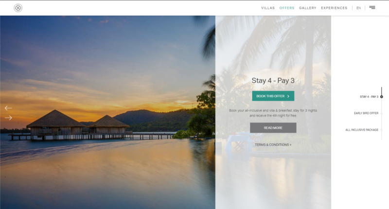
- Offering a design that is unique to this website, the special offers and accommodation pages have a horizontal layout that requires minimal scrolling. The resort has a large number of room types: this design gives an immediate snapshot of all options and presents content concisely.
- While researching the hotel’s old site, it become apparent that pages were too long and the user did not get to see important information below the fold. Reducing the need for scrolling with the new design was vital and this arrangement solves this issue cleverly.
- These key pages focus on showcasing the resort’s fabulous imagery, keeping the content to a minimum while highlighting the key call-to-action elements such as price and the booking button.
- Customers are encouraged to book direct with the hotel: an attractive panel clearly highlights all the reasons reservations should be completed here & now.
- The mobile version offers a simplified version of this design but the emphasis on call-to-actions remains prominent. Users are only ever a touch of a button away from completing their booking.
Wellness & Dining Through the Lens of Instagram

- These pages present a different style but with the same purpose: horizontal tabs aim to eliminate the need for scrolling through the pages.
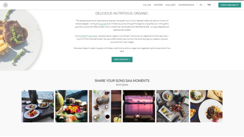
- Putting user generated content to the forefront, this layout makes excellent use of the hotel’s stunning Instagram images taken by guests. A dedicated hashtag #songsaa invites visitors to start a social conversation and to share their own experience.
- Large image and content panels allow for responsive design so visitors are treated to the same flawless experience whether they browse on a desktop, mobile or tablet device.
- Content is revealed gradually with moving panels that lends energy and a dynamic feel to these pages, while keeping the browser engaged at all times.
- After reviewing the client’s previous website, our marketing specialists identified that declining revenues were attributed to slow page load time and high bounce rate. These problems contributed to lower engagement and ultimately to less bookings. The development team ensured that these crucial issues were remedied while building the new site.
Is it time for a new design for your own hotel’s website?
Just drop us a line and we will gladly prepare concepts tailored to your individual needs.